PLATFORM MODERNIZATION
Upon joining Vermont Systems (VSI), it was immediately apparent that it was time to upgrade the design language of the core product, RecTrac. I set out to bring the product 20 years into the future, and improve usability and navigation for all of our 1100 municipal customers.
The Need
Users of RecTrac often spend a majority of their 40 hour work weeks within the application; managing everything from municipal facility rentals to morning yoga classes at the local community center, and even the local snack shop at the ball field. While park and recreation departments are fairly invisible to the average community member, it is actually an incredibly large business with many moving parts and significant overhead.
RecTrac's most recent version, the browser-based 3.1, had been introduced to its customers in 2014, and the developer designed interface paid homage to the original desktop application initially released in the late 1990s. While this interface was comfortable for many users visually, the design patterns did take the rapid growth and complex feature set of the product into account.
Working with our product team, which had over 35 years of combined experience at VSI, we knew we needed to work with our customers to solve their largest pain points while modernizing the design language to create an application that was designed from the ground up to feel at home on the web in a variety of screen resolutions.
The Exploration
As this was the first design exploration that VSI had done as a product team, we experimented with many different concepts and ideas through whiteboard sketches, medium, and high fidelity mockups. Many ideas never made it past the whiteboard, but several made their way though conversational phase with one or two high fidelity mockups before being cast aside for a style that better represented who we were as a brand.
The core of many of our mocks was how we would improve our users' navigational flow, and support their many simultaneous workflows. With countless conversations, we determined several key features that were a core requirement:
- Tabs
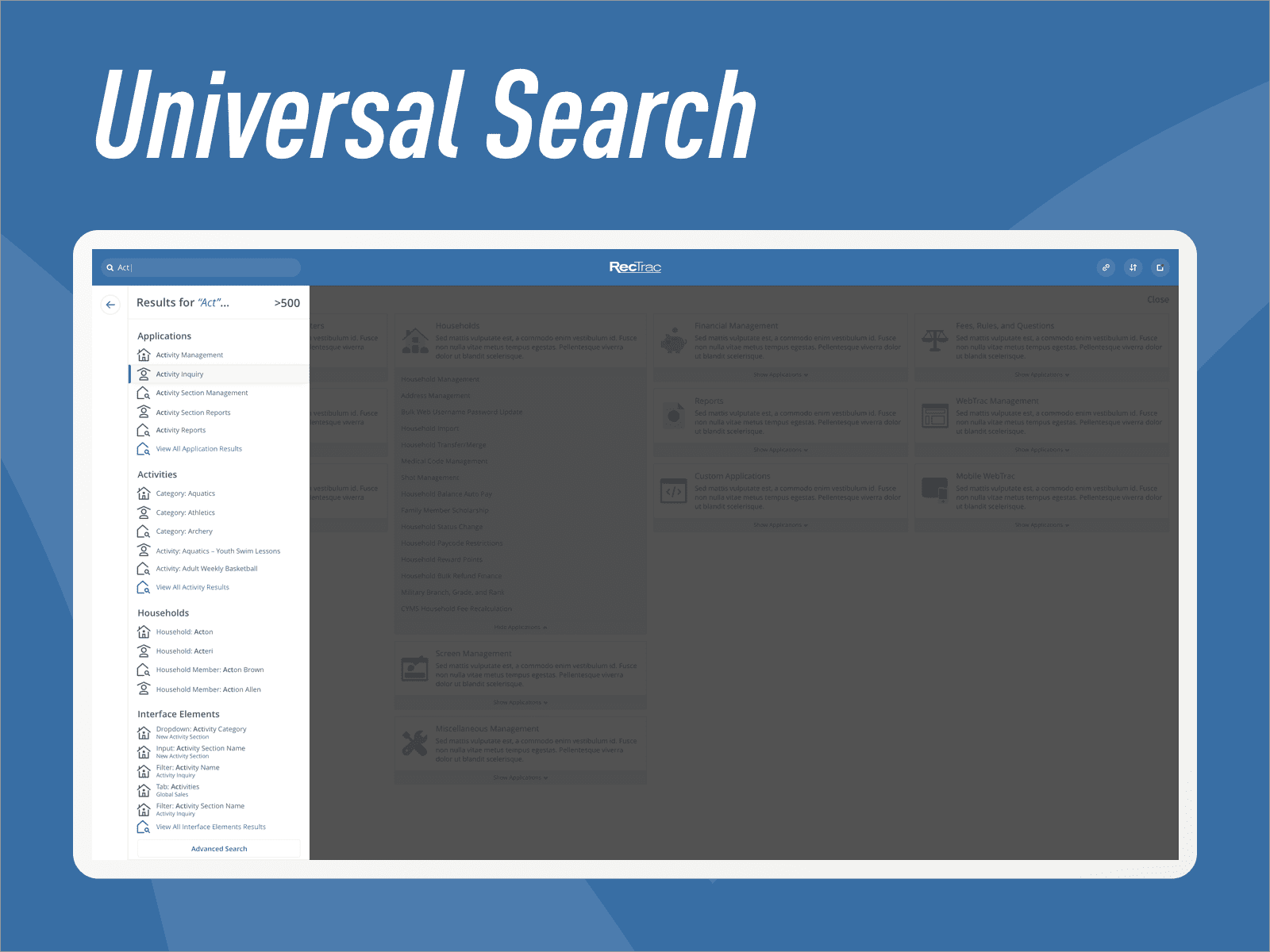
- Search
- Customizable and Modular Interface Elements
- Support for Existing Customization
- Minimal Learning Curve for Existing Users
- Minimal Configuration for Existing Users
- "Modern" Aesthetic
And this is where the fun begins.
The Collaboration
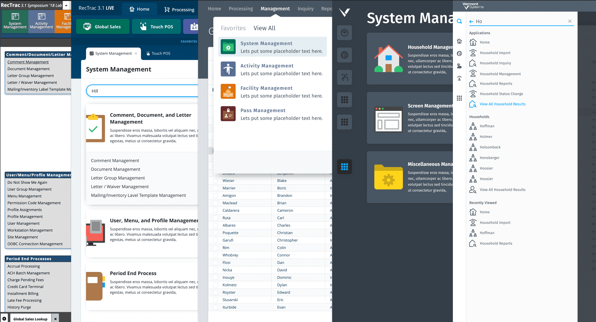
While many of these requirements were expected, the reality set in quite quickly when collaborating with the development team. Much of the application was drawn entirely by the Progress OpenEdge backend, delivered via XML wrapped HTML. Significant structural changes and state monitoring were not possible without substantial modifications to the application. However, this did not hold us back.
Working closely with our engineering leads, we were able to modify the designs to find a great middle-ground of decoupling the navigational layer of the application from the functional or customizable core of the application, allowing us to improve the number one and number two pain points of our users; navigation and multi-tasking.
We decided on a VueJS navigational wrapper with the main content area utilizing the previous legacy backend, still being entirely rendered in served in the traditional way. This allowed us to keep our entire communication layer intact while updating the styling to match the new, updated frontend stack. All of our users' custom page layouts and style customizations within the application would work with minimal impact when adopting our new design.
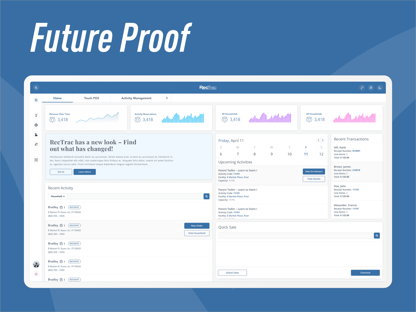
Beyond legacy support, our segregation of services allowed us to ensure that we could apply our new design language to completely new concepts, such as dynamic dashboards and modular landing pages.
The Outcome
After nearly eight months of design, research, and development, we launched our new design language paired with an all-new corporate brand at the 2019 National Recreation and Parks conference in Baltimore, MD. Together, they ushered in a new era for Vermont Systems, which was dubbed "VSI Next-Gen".
VSI Next-Gen was not just an external message. This was a change to the way we worked together as an organization, and a transition from purely a functional application, to a product and experience focused development process.
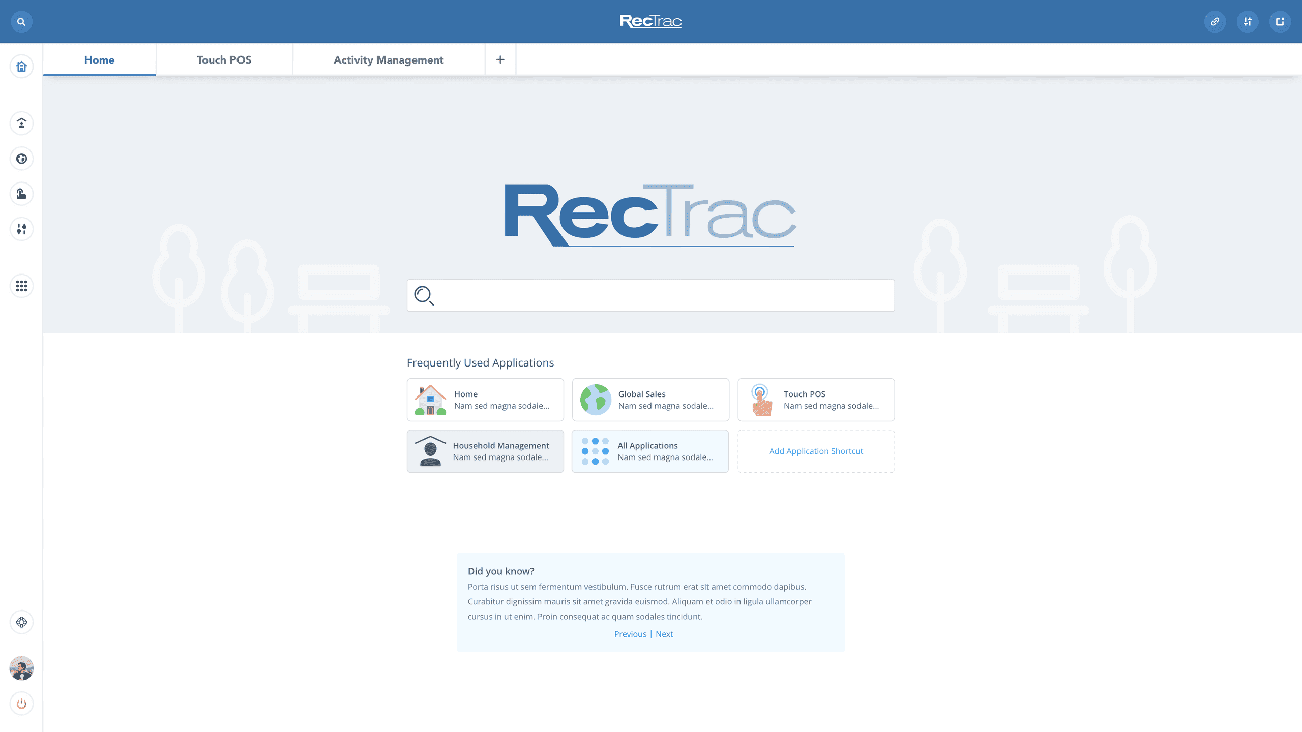
Our application transitioned from a ribbon-style menu with multiple submenus and clicks, to a simplified sidebar with a clear, concise, and easy to use search.
We allowed users to customize their landing pages with their most used parts of our application with a simple WYSIWYG editor, so even our more novice users could find their way around.
Working with the greater VSI organization, we created live streams to interact with our customers to deep dive into our changes and gather feedback in real-time, a trend that continues on a bi-weekly process, revealing new features and best practices with the participation of our product team.
With this open channel of communication, our updated front-end framework, and a constant drive to improve the experience of our platform for our customers, we continued to improve the user experience with each and every new release.