PLATFORM MODERNIZATION
With 3 interconnected products, each with their own independent user experience and design language, the Chute team knew it needed to unify their suite of applications. I worked with them to simplify their offerings while bringing improving their overall workflows and usability.
Going Up
I joined the Chute team in March of 2017 as the sole designer of the newly restructured product team. As a lean team of just 3, we got to work.
The product was legacy, being designed almost 5 years prior to my joining, with very little attention to updating the user experience or optimizing for user flow. Instead, a separate platform was built that lived alongside the core platform, which offered improved UX, but fewer features that users needed to be successful with the overall product.
We immediately began whiteboarding, auditing our platforms for feature parity, interviewing our users, and ultimately, decided it was our top priority to modernize, improve, and unify our platforms into a single cohesive solution that was delightful to use while helping our developers have an easier timing maintaining our product.
We quickly knew our solution was to redesign our platform and update our architecture.
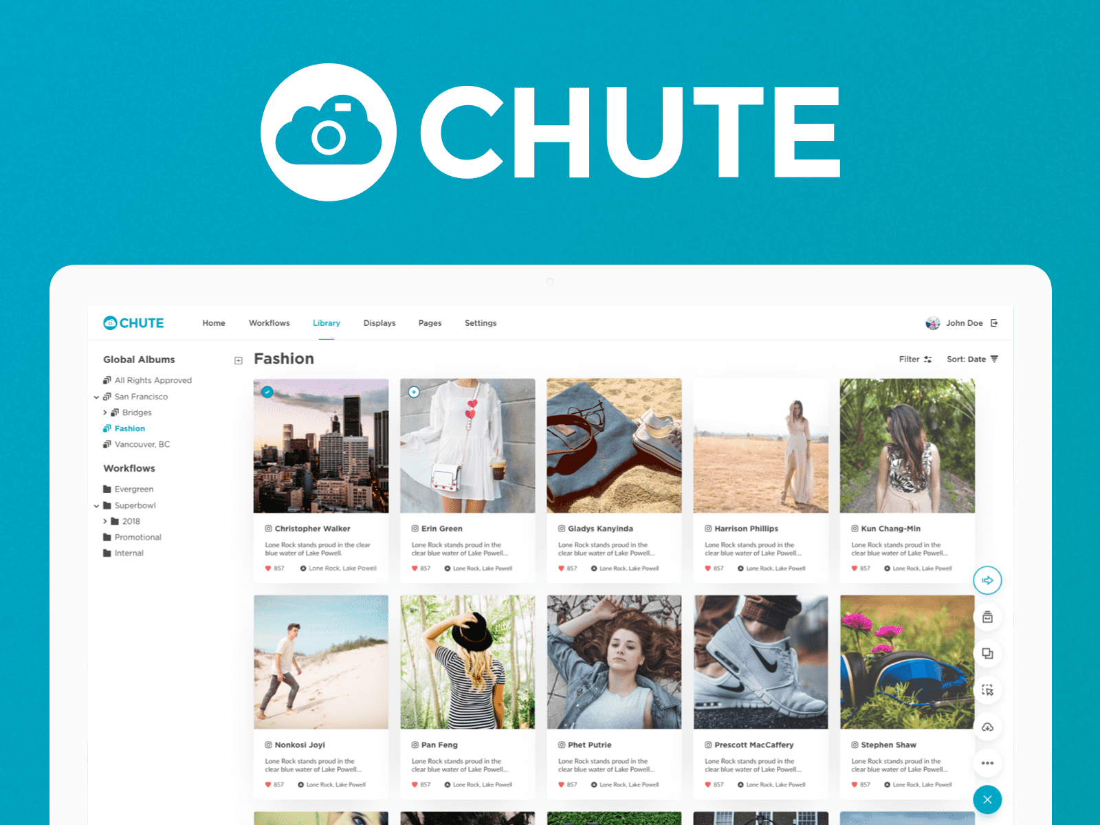
Simple and Modular
One of Chute's core selling points is the flexibility and the adaptability of the platform for different types of social media campaigns. It can scale with you and your team from individual users, to teams of dozens of dedicated moderators for Super Bowl campaigns.
Our design and architecture, while intricate, was not quite as adaptable when adding or updating features. Developers would have to inspect multiple APIs, and our platform was not component-based, which meant updating something could potentially break something else. Our team collaborated with engineering almost daily on a design system and feature set that would be both beneficial to product and engineering.
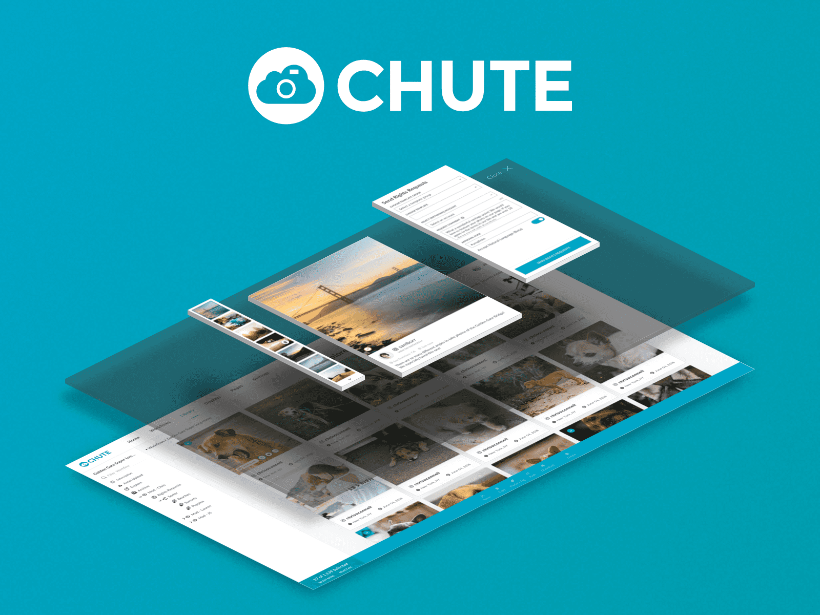
We ended up building our redesign using modular components that had major elements reused throughout the platform. Our Image Lightboxes would consist of the same major component as a Rights Request Lightbox, which previously shared very little code.
Enterprise State of Mind
Chute has always had the unique ability to support enterprise and small businesses alike, something a lot of companies strive to do. Throughout our design process, we wanted to ensure that our new and improved experience could bring this to a whole new level.
Initially, we had experimented with more dramatic changes to the way our platform functioned but instead realized our complexity was actually what customers loved most. We wanted our individual users to be able to get up and running with as little assistance as possible, employing the use of machine learning, recommendation algorithms, templates, and focused a great amount on our onboarding process and messaging.
We made sure to involve our customers every step of the way, from wireframes to interviews, and personas based on each of our core users from our main segments: E-Commerce, Travel & Destination Marketing Organizations, and Enterprise. This helped us streamline our goals and keep focused on what mattered most to our users, and they truly felt like they were part of our process.
One of the best parts of the process was being included in what our customers called their "Chute Family." This was a testament to not only how important our customers were to us, but how important and involved they were in our process.
Knowledge Gained – Relationships Matter
Chute was the first company I worked with where the customers were as important as the employees in our office. Every step of the way, we made sure to collect input and ensure our customers' voices were heard. Not only did this simplify our product process, but by involving our users, they felt as attached to us as individuals as much as our product.
Throughout our redesign process, customers that tested our prototypes and were able to preview our new platform were significantly less likely to churn. In fact, we had nearly zero net churn for several quarters in a row, and even growing our business through word of mouth.
While I have always designed for users, designing with users can be beneficial for many reasons. Who uses your platform more than those that require it for their daily routine? Users knew what to expect as features were rolled out, and they felt as though it was as much their product as ours. Not only that – it enabled us to pinpoint exactly what it was that users wanted through interactive prototyping. While this process was slightly more time-intensive, the tradeoffs in building relations were invaluable for our company.